top of page
DERMAGUARD
For this brief I was asked to do a brand redesign of 'Dermaguard'. They are a brand focused on skin cancer prevention and their angle is to be a friendly looking alternative to the harsher and more clinical looking alternatives.
Briefing

Project Development
Brand Identity
Understanding the brand's new direction
I began this project by understanding the brands ideology and how they wanted to represent themselves to customers. Using multiple different techniques I pinned down who they were and who they wanted to be with this redesign.
I then created a small bit of text that would guide me through the brand design.
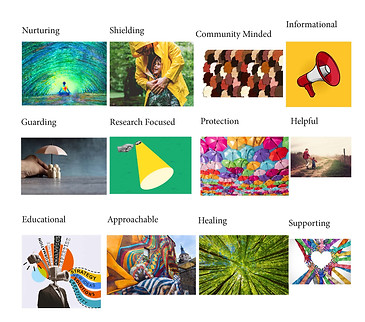
"DermaGuard is a business about skin cancer preventation. Getting patients to prevent skin cancer before it happens through check ups before they know they have it. They use state of the art technology to protect the community and support better health outcomes as a result. Dermaguard aims to be a shield for the community against the damaging properties of the sun and try to educate people against it, and heal those that have already been damaged."


Ideation
After understanding who the brand was, and pinning down six words to represent the brand, I briefly sketched some simple graphics that represent these words. I then created three directions that I could take the logo and thus the brand and had a client meeting to choose. The third option was picked with the humanoid figure.

Initial Logo Sketches
Now having the direction that the logo was heading, I fleshed out the style that it was leaning towards.
Logo Refinement
After holding another client meeting, the first logo sketched was picked to move forward with. Now transitioning to Adobe Illustrator, I can add the colours necessary to further illustrate that comfortable and approachable feeling to this brand as was requested.
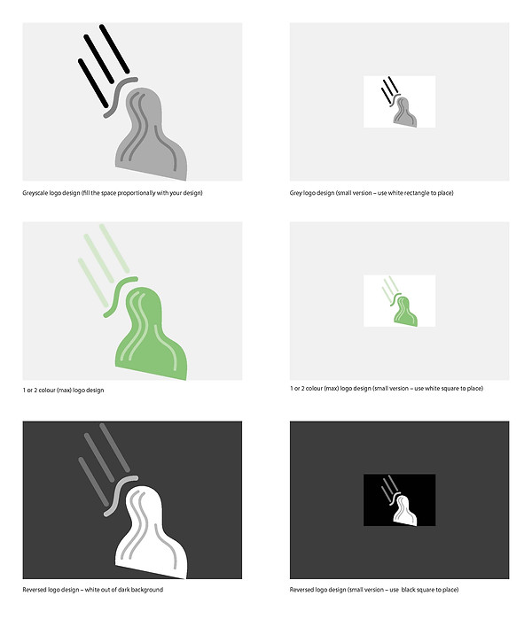
Logo Resolution
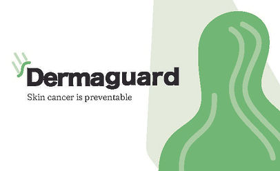
After one more client meeting they decided they liked the graphic above the human figure, but wasn't sure about the figure itself. This then created what is the final logo you see here.
Business Card
Creating the Business Card
Now that the logo was finished, I could continue with the other deliverables. First off was the business cards. I had the colours and feel of the brand created from the logo, so it was just expanding on that to create the graphics for the cards.


Final Card
This was the end result of the business card design. There is less going on to be a distraction comparatively to the first card, but still doesn't look harsh or clinical.

Deliverables
Bringing everything together
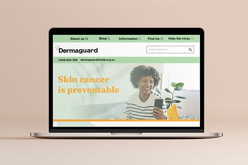
The rest of the deliverables (Website Mockups and Masthead) were all derived from the styles created in the logo and the business card. A splash of light yellow was added to the website to help give it some much needed contrast.
The deliverables are in order (Left to Right): Website Mockups, Masthead, Business Card, Logo


bottom of page