STARCK EYES
Phillipe Starck is a French industrial architect and designer. He focuses on household furniture like chairs, tables and other common use items. He has also done plenty of interior design for hotels and restaurants. Starck does not have a distinct style, or a preferred use of materials or colour, but chooses to address the needs of the client individually, and tending to their choices. His only ‘hallmark’ would be his preference for flowing shapes or small details.
In this project I was tasked by the client to create items for an exhibition about Phillipe Starck. I created a poster and mockups for a supplementary app to be paired with the exhibition as people wander through it, to aid with the explanation of the pieces that are being displayed.
Briefing


Project Development
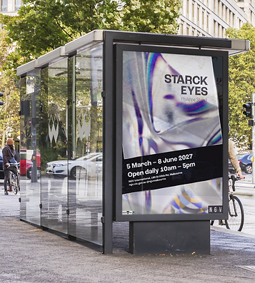
Exhibition Poster
Beginning
In the beginning, I spent some time just figuring out creatively, who Phillipe Starck is, as that is the main side of him I will be representing. I used different tools to generate ideas and get the creative process flowing.


Colour
Here I used different album covers that I believe have either cohesive or clashing colour pallets. From this activity I gained a better understanding of why colours are successful. I used album covers of music I know well. This is important because I was able to compare the content of the music and the album cover to know if the colours represent the content well. This activity helps with knowing what colours work well together and if/how they can represent themselves through colour, successfully.

Initial Poster Development
I generated two differing posters for the client, both taking different paths to represent the exhibition. I did one that was more tame and reserved, and one that was on the more intense and severe side, I feel this strategy was successful as it allows the client to have a breadth of direction to take the exhibition in the way they want, and therefore helps me do a better job.


Poster Development and Revision
This poster went through quite a few versions throughout this process. Having meetings with the client on a weekly basis was the driver of many of the changes in the poster, trying to hone in on what was being requested of me. From the first client meeting I had the general style down, but details and cohesiveness is where posters shine.


App Mockups
Beginning
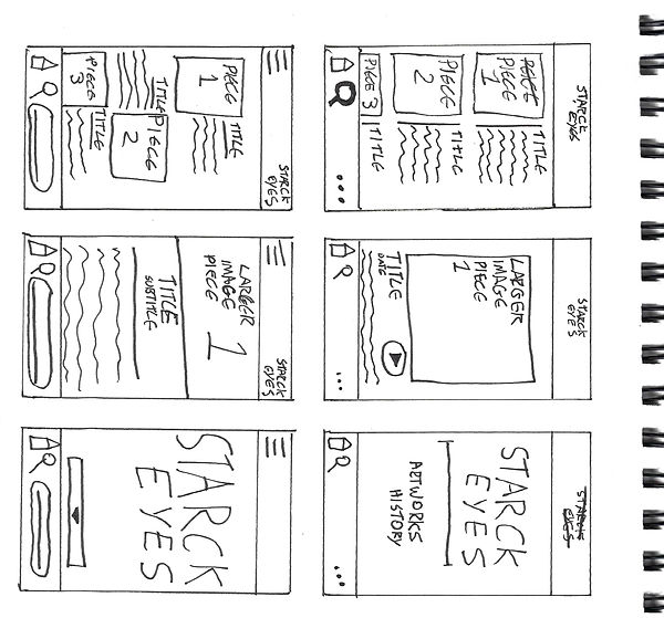
I started with creating wire frames for the website. I can skip the initial process of ideation as I already know who Starck is now, and I already have the style of the app generally locked down as it should mimic the style of the poster.
I tried to keep the layout of the app relatively simple as it will be used during the exhibition, which means it needs to navigable like most other apps; it must be easy to use as people in the exhibition don’t want to spend time using an app they will likely just use once.


Further Refinement
Taking from the style and imagery in the exhibition poster, I displayed the content of the exhibition in the order that it is seen, and keep the navigating simple. The content in this version of the app gets lost in the background quite a bit, this is changed in the final product.

