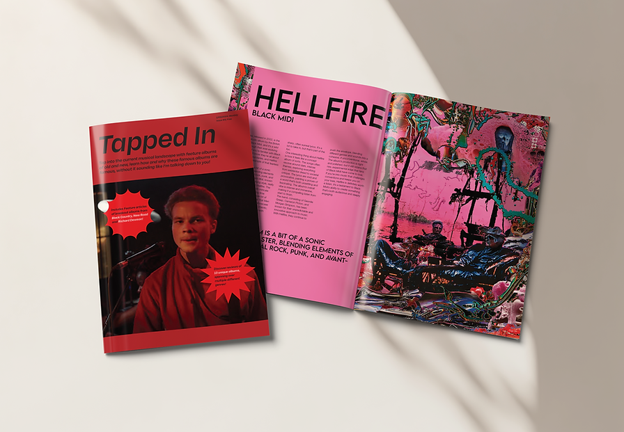
TAPPED IN
For this project I was asked to create a magazine focusing on recommending music to readers that would usually not be found through normal commercial means, like the radio or pop culture. This may be because the music is older or the artist is relatively unknown in pop culture.
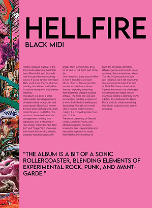
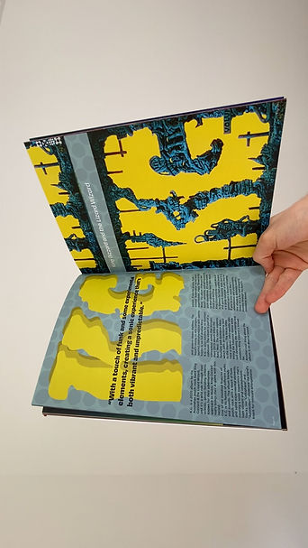
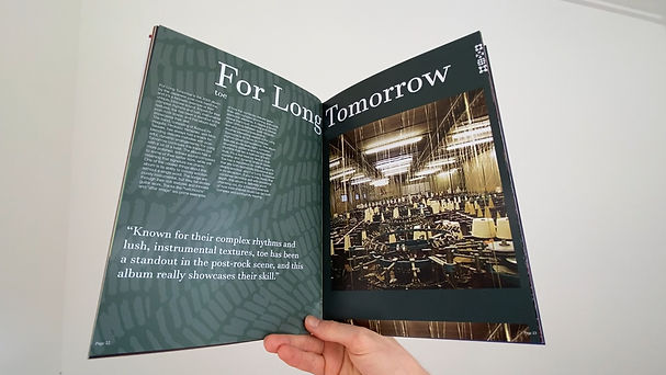
Tapped In is press publication document about showcasing new and old music, live music and other adjacent, but music related things, whilst in a non-snobby way. It was designed to have each page try to mimic the designs of the album covers of the album that was being discussed, and to be full of colour and life.
Briefing
Project Development
Magazine Layout
Moodboard
I started off by creating a moodboard to find the general style I wanted in this magazine. It was supposed to be showing off the artists and their music so I chose inspiration items that did the same thing.

Initial Concepts
After pinning down the style I was going for, I created a couple mockups to fully get a grasp of any of the themes I was going to use throughout the publication.


Further Refinement
After pinning down the style I was going for, I created a couple mockups to create the publications themes. One theme that I decided on were the use of windings in the publication. In the Editorial Introduction I outline the main sections of the publication in little pictorial windings. This didn't work as well as I wanted it to, but I think I can use this more effectively in a future publication.


Finished Product
After talking with the client and coming to a finished product, I printed the forty page publication for them in a mockup so they could have confidence in what the final product would look like physically.