STAREWELL PROJECT
This project was my Capstone project for my Associate Degree of Graphic Design. I created and designed for a brand I created called STAREWELL.
The brand revolved around finding stairwells in Melbourne that are exclusively function, and partnering with upcoming artists to create artwork for the space to spruce them up.
Being discovered as an upcoming artist in Melbourne is becoming harder from galleries becoming more expensive and selective as well as spaces to display art becoming more sparse. Finding stairwells to display art in solves a few different problems. It gives artists a place to display their work, encourages people to take the stairs and get some exercise, and lastly makes Melbourne a more inspiring place to live in.
The deliverables for this project include:
Posters, Brochure, Website Design, Mailer Box + Note
and T-Shirts.
Briefing


Project Development
STAREWELL Project
Research
Firstly, I needed to define the idea that I had for this project. What does the company do? What good/service do they provide?
Next, I needed to define things like the target audience and the user journey, as well as figuring out what types of branding suits the target audience and brand that I am creating.
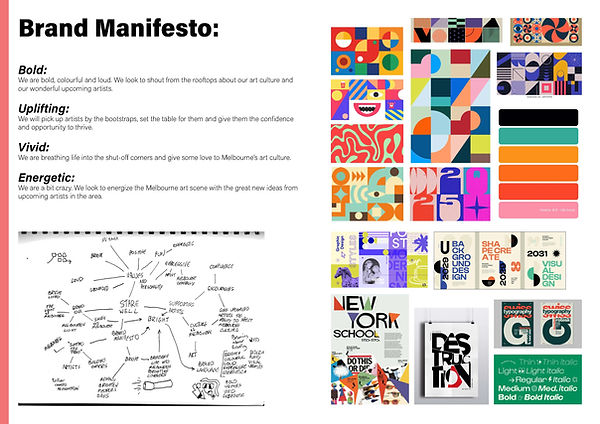
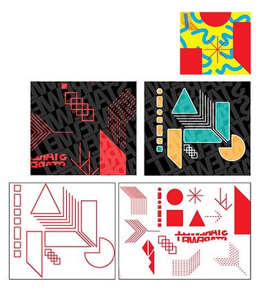
Initial Work
Now that I have the brand identity established, I start to visualise some of the ideas I had been generating whilst creating the brands purpose and manifesto.
Refinement and Posters
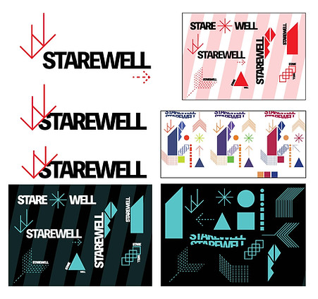
After this first round of research and idea generation, I went back and pushed what I thought worked well, and left behind some of the ideas I didn't think were working.
This is the same time I started to work on the first deliverable, the Poster.
Poster Development
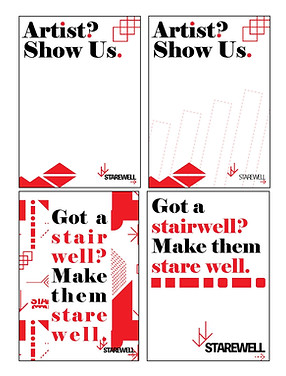
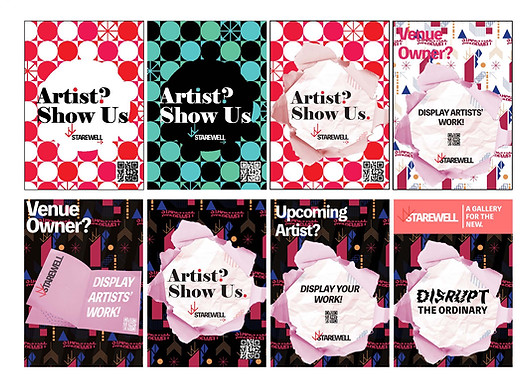
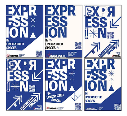
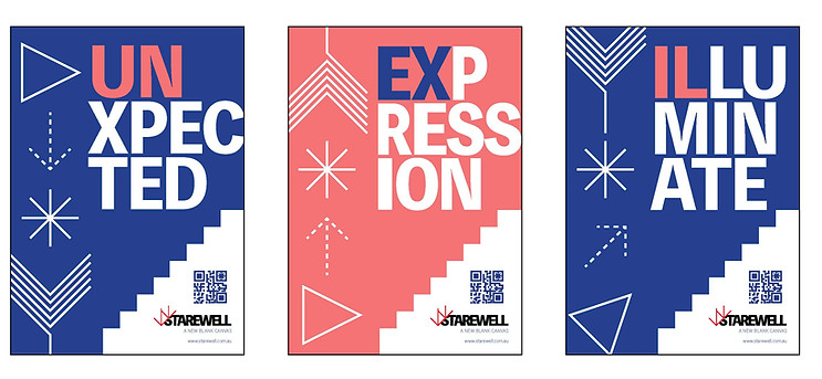
I decided to work on the posters primary, and use them as the litmus test for the brand assets. I could test whether what I was creating for the brand could be used in situ, like on a poster. This is why the posters went through a couple different defined stages.

Finalising Poster Designs
I decided to work on the posters primary, and use them as the litmus test for the brand assets. I could test whether what I was creating for the brand could be used in situ, like on a poster. This is why the posters went through a couple different defined stages.
Now that I have fully outlined and created the brand assets and colours that will be used in all deliverables, I can begin with finalising deliverables. These are the finished posters. These will appear in underpasses and tunnels, and around train stations. They will be in places that prospective artists are likely to travel through.
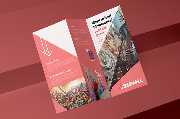
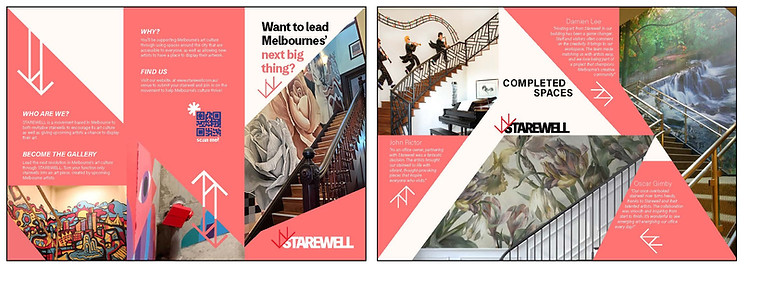
Brochure
This was the only other deliverable that didn't have a finished design style before creating it. This is why it seems like it goes through the same troubles as the poster designs, because they were being designed roughly in tandem.

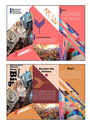
Finalising Brochure Design
Here I complete the brochure design, which is the where the styling of the brand comes into itself and is almost fully resolved.
Pink is for the space owners, which will be supplying the spaces for art to be displayed, whereas blue will be used for the artists.

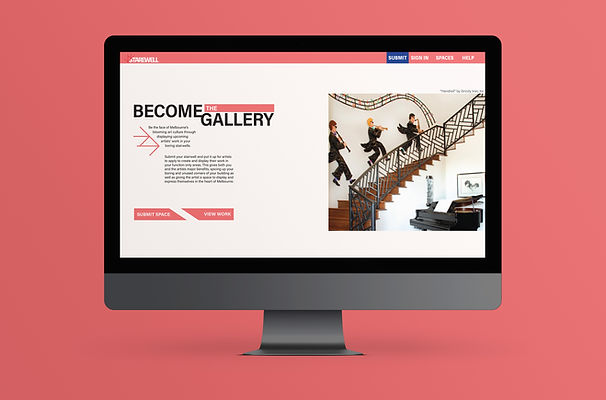
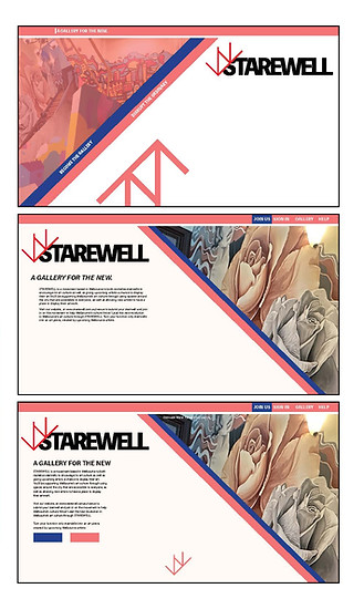
Website Mockup
Next, I worked on the website design. This was not a full functioning website, but rather what it would look like if this brand was a reality.
After finishing the design for the poster and the brochure, rolling out the brand assets and design philosophies to the rest of the deliverables was a lot easier.
The websites function was to give both groups (artists and space owners) a place to find each other and submit either artwork or stairwells. From there, they can find each other and start work.
The smaller panels of work are the old versions, the larger images are the finished work.
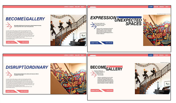
Website Mockup Continued
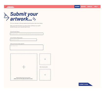
These are the areas where the space owner (top) and artist (bottom) would submit their work. This is the layout of how and what they would need to submit.
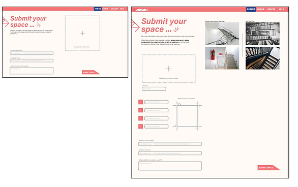


Website Mockup Continued
Here is the pages that would come directly after submitting work for either party, and then below those two is the section of viewing stairwells to apply to complete work for.

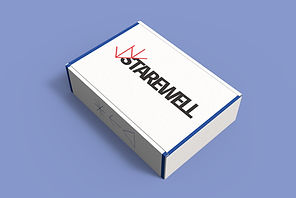
Mailer Box + Note
The mailer box and its supplementary note were also relatively quick to design. They were mostly blue, to fit in with previous design styles that had been stated. The note was to be included inside the mailer box as a thank you note to the artist. The mailer box was to be sent to the artist after completing work.


T-Shirts
Lastly, the T-shirts. They were to be the other item inside the mailer box. It was initially going to be white and blue, to represent the artist, but I changed it to the brand colours as they look a lot nicer, and having two different styles also gives the artist a choice on which one they want.
