BAKER'S CHOCOLATE
The brief I received from the client was to create a packaging redesign for the Lindt Orange Intense Dark Chocolate. I was given free range to take the design in any direction I felt was best.
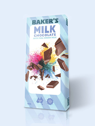
I was not happy with how Lindt presented the back of the cover. It had a lot of information with a lot of different fonts, as well as variation in the direction the text goes, its hard to read and I’m not sure what they want you do get out of it; It seems like a place to dump information. I was aiming with my back cover to look less like a information dump, be legible, and most importantly for the brand, look fun. The front cover was designed to look like a fun, colourful explosion. It works as the focal point of the whole package, as it is the only area that isn’t mainly blue. i think it gives the effect of fun successfully. Lastly I slightly simplified the package dieline, as I thought, Because my redesign is supposed to be less fancy than the Lindt brand, I didn’t think that some of the small curves around the sides and bottom tabs were necessary.
Briefing

Project Development
Packaging Redesign
Market Research and Moodboards
After doing some market research into what was already out on the shelves, I noticed there didnt seem to be much of a range that focused on chocolate as a means of celebration, in terms of a family block of chocolate, except for some of Cadbury. So by learning this, I found my angle.
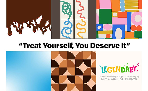
I began developing a moodboard to represent the vibes and feel of my brand and packaging. It needed to be colourful, bold, loud and fun.
Early Design Work
I initially tried to scope out how pastel colours would work together, as I thought they were a good place to start, having light and fun connotations. Working out the logo was also weaved into this process.
These are the early renditions of the idea of Baker’s Chocolate. Throughout the whole design process the idea of
celebration, fun and colour were front of mind. These ideas guided me through all subsequent design decisions.

Playing with Texture
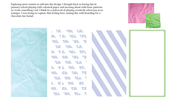
Exploring more texture to add into the design, I thought back to having fun in primary school playing with coloured paper and messing about with basic patterns to create something successful. I think its a universal experience of playing creatively when you were younger. I was trying to capture that feeling here, mixing this with branding for a chocolate.
Initial Mockups
These were the first renditions of the front of package. I usually jam pack the first couple of designs to see what works and what doesn't, I can then subtract from this and find the best parts. They are rough around the edges, but they formed the basis of what where to go next.
