ALBUM COVER REDESIGN
This project I was asked to create both an album cover redesign, as well as some extra items/peripherals that could be sold for the band.
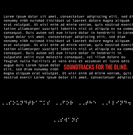
Soundtracks for the Blind (SFTB) is an album created by Swans, and I have reimagined the album cover here. The album, based on the name is designed in a way to make it look like the design is for blind people, with dummy text and Braille featured on it.
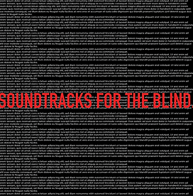
The Design is based on the fact that the album is for a non-existent film, so I have taken inspiration from the look of old film, and mixed that with the design choices on the front to create the back cover.
Briefing


Project Development
Album Cover Redesign
Research
Before starting my design work, I research the original cover and the style and history of the music, to understand exactly what I was presenting.
The cover was likely made digitally, as it just uses simple colours, fonts and a bit of extra spacing. The genre is rock, which can be quite a broad genre in terms of design, but commonly found designs can be simplistic as shown in this cover. I would keep the simplistic designs but mess around with ideas about blindness in the design and play with typography as the main design choice in the cover.
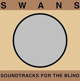
"Soundtracks For The Blind" by SWANS
Initial Work
Now that I know what I am representing, I started to design the vinyl cover for the album. Because it is an album about a (non-existent) film, I leaned into that side of it, but tried to not use cliches. I attempted to mimic the font and style of script sheets, but also leaning into the chaotic side of the film, kept it looking a bit crazy and unkempt.


Refinement
After more refinement, I have tried to further emphasise the core concepts I was pushing in the original idea. I think some of the above concepts have legebility issues, which can work in an album cover, but its also a little hard on the eyes, especially the second variation.
Completed Design
The finished product collated all the ideas that I liked through all the other concepts that I created, and subtracted from the areas I didn't like to create the finished piece.
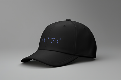
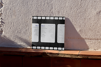
Extra Peripherals
After completing the design, I also created some extra peripherals that might be sold at a concert or a meet and great for the band. This includes both a cap and the physical vinyl of the album.
The album cover was made through printing on a Roland printer, then cutting both the cardboard and vinyls pieces to shape, and then sticking them on to eachother.